
Hello all! As I was browsing Bloglovin' last week, I came across Chaitra (from PinkPot)'s blog post about using CSS to improve the look of your blog, and I was inspired to add to her post by writing my own.
She is a huge talent for blog design and coding, so if you haven't already seen her blog post about using CSS, do so here! I'd love to add my own little tips and tricks, and I hope that you find both her post and mine helpful.I've written/coded/designed CSS and HTML help websites and pages before, and I'm not sure why it never occurred to me to carry that skill over to my own blog. I suppose part of it was that there are so many premade/ready to purchase or download blog templates already out there that the skill to make or code your own is lost on a lot of people, or rather unnecessary as a whole. I didn't think about anyone that might want to simply improve upon a blog template using a few simple coding techniques.
I want to show you a few things that really make a difference in any website design, as well as just some fun ways to "spruce" up your layout, be it blog or something else.
Chaitra wrote about this one, but I wanted to expand on it and add visual representation. While these words are self-explanatory, a lot of people get mixed up when trying to use these attributes because they essentially do the same thing, but with different aspects of an element. Does that make sense? As an artistic person myself, I always thought visual aids helped tremendously so I put together a little image to help make sense of it.
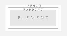
Having margins and padding really improves the look of anything. Having your text too close to an image, for example, really makes your page look crowded. Using proper margining and padding allows your elements to stand out and makes your design look a lot cleaner overall.
Below I have two examples of a blog bio/blog template cutout: one with a good amount of margins and padding, and one without. It's easy to see that although they both have the exact same content and the exact same layout, the latter of the two appears a lot more crowded and packed.


You can use both of these attributes either within your CSS (style sheets-- this will allow you to easily set these attributes for large elements within your blog) or your HTML (you might use HTML if you just want to change the padding or the margining on a specific element).
The above is a broad example of what you would add to an element in your style sheets. Below is an example of how you would use margins or padding in HTML.
I like to do this quite a lot with various things (image links mostly) and a good example of hover opacity is the share icons in my blog bio. When hovered over individually, each one lowers in opacity. Something that honestly gets a bit under my skin (not sure if I'm weird for this) is when pages have links that don't change when they're hovered over. The only way to tell if something is 'clickable' sometimes is when your little cursor goes from the mouse to the 'click this' hand, right? I hate that! It's a lot more fun when a little clickable-icon changes, even just ever so slightly, when it's hovered over.
Below are two images that are linked (just to my blog's homepage, if you were so curious). The heart on the right has the hover opacity lowered. Adding this basic code to any sort of linked-image (or link in general but it's more noticeable with images) just adds a more dynamic feel to any design.


The easiest way to do this, in my opinion, is to set a class within your CSS and then just use it within your HTML whenever you see fit.
The above is your CSS class. I've classed it as 'cassie' but it doesn't matter what you put, as long as it's unique to that class and that class alone. Following the class, I've specified that the attributes within the parentheses are only to be applied when your [image] is hovered over. The numbers relate to the level of opacity or transparency you want. The higher the number (from 1-10) the more opaque. The lower the number, the more transparent. For my heart above, I used 7.
Below is how you would use this class in your HTML.
Make sure the class name is the same in your HTML as it is in your CSS and that's all you need to do. Since you've got your class set up in your style sheet for good, you can continue to use it for any other links anywhere in your design as long as you specify the class name, which in this case is "cassie".
This one is [somewhat] similar to the previous, but it's a little more fun and offers more options for hover-play. In the previous code, all we did was change the opacity upon rollover of an image. Fun for sure, but having an image rollover is when you hover over something and it changes to another photo.
It sounds more complicated than the above, but it's actually only a very simple code. This type of thing would be useful if you had an image linked and wanted text, a symbol, or something else to appear when you roll over the image.
The example I'm using below is one where you might want to use an image rollover to display the title of a blog post over the image once hovered. The only things you need to have are an image (your original pre-hover photo) and your edited image (the one you want your image to look like when hovered over).

The image above is from thedesignchaser.com!
The code below is what you will use for your image rollover. Image 1 is pre-hover, image 2 is post. Enjoy!
That's all guys! I really hoped you enjoyed this, and definitely check out Chaitra's original post.
See you next time, sunshine!
C, xx


No Comments Yet, Leave Yours!